What is a responsive website -: Responsive website use for the designing . Website design has an essential tool for anyone with a digital presence. Many people are using different system for seeing the website as like some people search the website in Personal computer, some one are using laptop, and some one are using tablet or mobile etc.There size are different to each other.
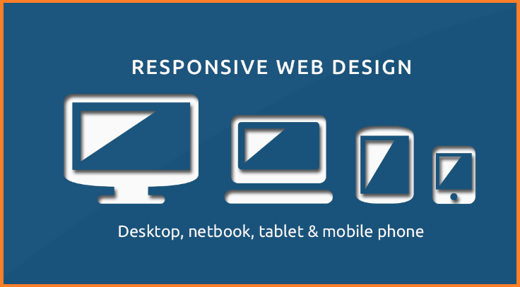
When we are opening any website or blog in any device the website will change according the device . It’s adapt the screen size of the any device. Means it will show according the device.
Responsive Web Design is using HTML and CSS to automatically resize, hide, shrink, or large a website. It look good on all devices as like desktops tablets and smart phones.
How Responsive website work -: Every website using html code . Each website has Homepage and other page . In this home page and other page have many text, images, etc. In the web pages are using style-sheet this is called the cascading style sheet (CSS). A responsive website are using an alternate set of CSS files depending on the device being used to access the site.
Make a responsive website -: For creating a responsive website there are some changes that are necessary. Add this changes in your website pages. Use some setting in your page creating a responsive website.
(A)- Using html code in your website
1-: View port setting -: This is the first necessary thing you can add this text in your <meta > elements . This will set the view port of any page.
<meta name="viewport" content="width=device-width, initial-scale=1.0">
2-: Make responsive image -: Responsive image are that images that fit any device as like tablet or smart phone.In this use max width property 100%. Use the alt tag in your image.
<img src="img_girl.jpg" style="width:100%;">
3-: Give the responsive text-: When we are using Heading in our page. Make it responsive as like
<h1 style="font-size:10vw">Hello Netnic </h1>
4-: Use the media query in your website-: Using the media query we can use different query in different browser size as like
<style>
.left, .right {
  float: left;
  width: 10%; /* The width is 10%, by default */
}

.main {
  float: left;
  width: 80%; /* The width is 80%, by default */
}

/* Use a media query to add a breakpoint at 700px: */
@media screen and (max-width: 700px) {
  .left, .main, .right {
    width: 100%; /* The width is 100%, when the viewport is 700px or smaller */
  }
}
</style>
(B) Using the bootstrap framework in your website-: You can use bootstrap code in your website web pages. You can add bootstrap code in your website <head> element . for example
<meta charset="utf-8">

<meta name="viewport" content="width=device-width, initial-scale=1">

<link rel="stylesheet" href="https://maxcdn.bootstrapcdn.com/bootstrap/3.3.7/css/bootstrap.min.css">

<script src="https://ajax.googleapis.com/ajax/libs/jquery/3.2.0/jquery.min.js"></script>

<script src="https://maxcdn.bootstrapcdn.com/bootstrap/3.3.7/js/bootstrap.min.js"></script>